 Zendesk
Dashboard Curation
Centralizing conversations usage.
TL;DR
Zendesk admins using conversation services had to switch between two separate dashboards just to see their full usage data. I owned and designed a new page inside the Admin Center so everything lived in one place, shipping to 10,000+ customers. See the final product.
Background
Growing pains
When Zendesk acquired startup Smooch.io in 2019, the platform was rebranded as Sunshine Conversations and became the backbone of Zendesk's messaging infrastructure. The two platforms, however, stayed siloed. As part of the Conversations team, I was brought in to help unify the experience, starting with how customers tracked their usage.

Customer service software
Omni-channel messaging
Powers all messaging services across Zendesk
All conversations captured in one place
Problem
Admins juggled two interfaces for one product
In order to view their complete analytics, customers were required to alternate between two dashboards, creating a fragmented experience.
As part of a broader initiative to bring Sunshine Conversations fully into the Zendesk ecosystem, I was tasked with building a page inside the Admin Center where customers could track their Monthly Active Users (MAUs) and Notifications in one place.
Design constraints
- New dashboard to match Zendesk's Admin Center design system
- No existing data visualization design system to lean on
Process
Mapping, sketching, iterating
Mapping the journey
I began by mapping the admin journey across navigation, viewing usage, and viewing history. The key insight: admins needed a snapshot of where they stood right now and a way to look back over time.

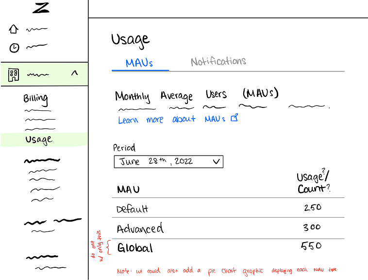
Sketching structure
I explored two directions early: a tabbed layout separating MAUs and Notifications, and a continuous scroll showing both together. I kept these rough as the goal was to stress-test the structure with stakeholders before investing in high fidelity.
Iterating the hi-fi
I ran regular check-ins with my mentor (Sr. Product Designer), the PM, and the Content Designer, and presented my work at team-wide stand-ups. The feedback was specific and pushed the design forward each time.
One page, no switching
Continuous scroll layout so users can see everything in one place.
Supporting scannability
Three call-out widgets for users to immediately read their data.
Content boxing
Following design conventions of the Admin Center so the new page felt native.
Final Product
Scoping to what was feasible
My PM asked me to design a barebones version first. Data visualization wasn't technically feasible for the initial release, so the MVP focused on the essentials: a clean table showing 6 months of MAU and Notification usage, with call-out widgets at the top.
The constraint forced me to figure out what the page truly needed, and what was just layered on top.

The MVP shipped version, focused on the table only.
Exploration
Visualizing the full picture
Once the MVP was scoped and approved, I was tasked with exploring what a visual version could look like as a future enhancement. I also designed for the full range of states a customer might encounter.
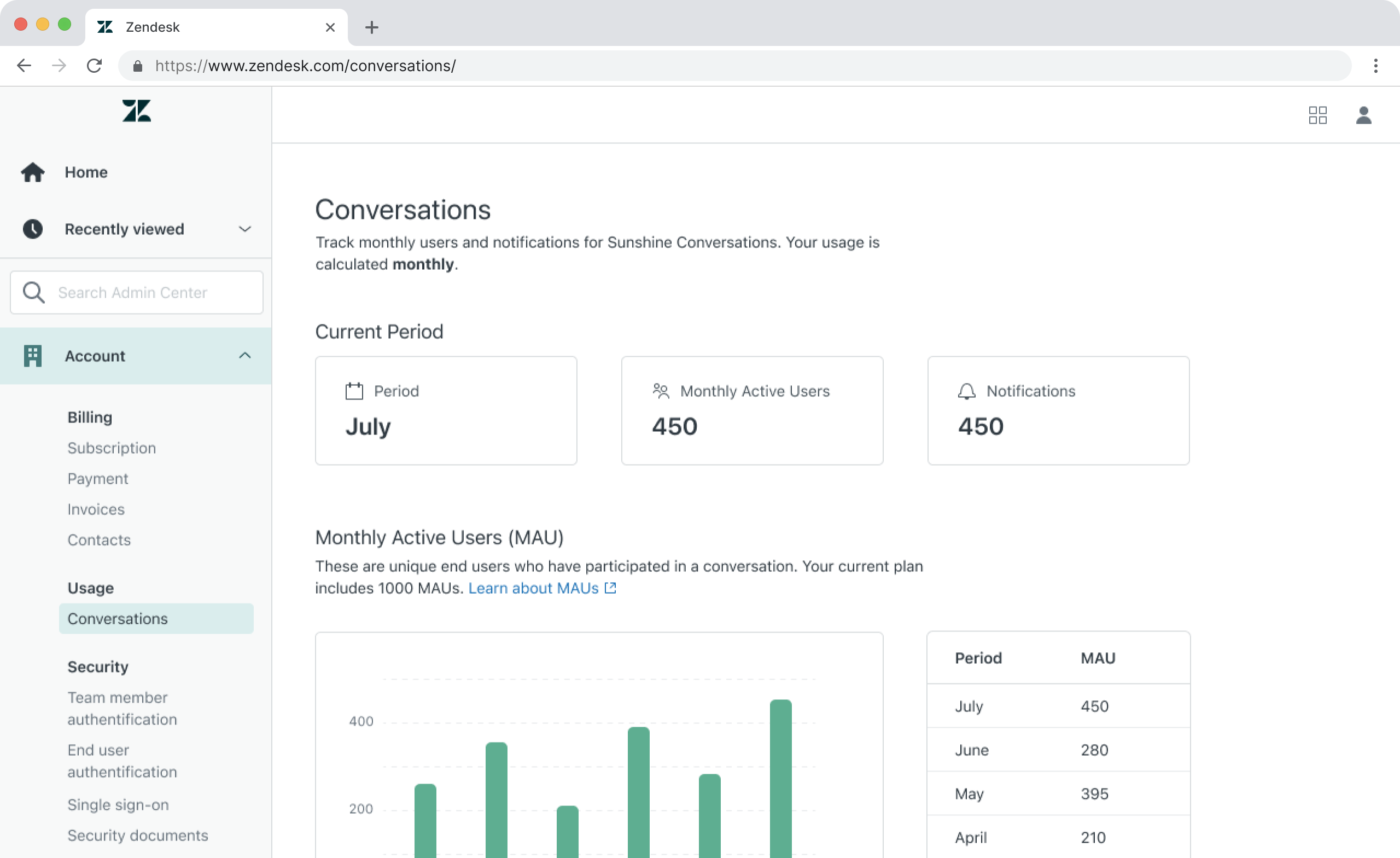
Normal usage
Current period widget, 6-month chart, and data table.

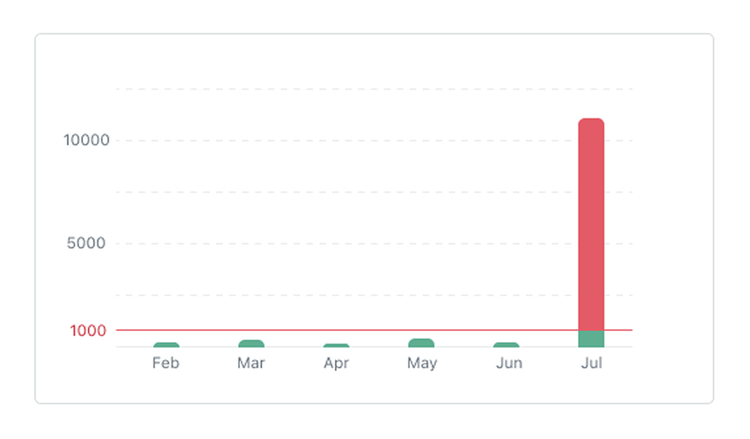
Plan limit reached
An inline warning prompts users to contact support to adjust their plan. Affected metrics are called out in orange.

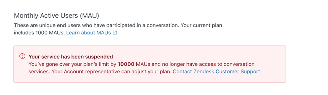
Conversations paused
When usage is severely over the limit, conversation services are paused and a prominent error banner drives users to contact support.

Impact
The designs shipped
My designs were approved and handed off for development before my internship wrapped. The feature went on to rollout to customers globally which felt like a meaningful way to close out the project.
0
Users reached at rollout
Signed off by all stakeholders
Reflections
Beyond the design file
Leading a real project taught me that product design lives as much in the conversations and tradeoffs as it does in Figma.
Constraints clarify
Designing within real constraints forced me to get clear on what the page actually needed versus what would be nice to have, and how to make the case for the best experience within those boundaries.
Embracing the loop
Each round of feedback was a chance to ask the right questions, navigate ambiguity, and ultimately pull the design somewhere better.
thanks for reading (✿・‿・)ノ゛
Up next
 FigBuild
 Digital Society Lab