![]() Digital Society Lab
Digital Society Lab
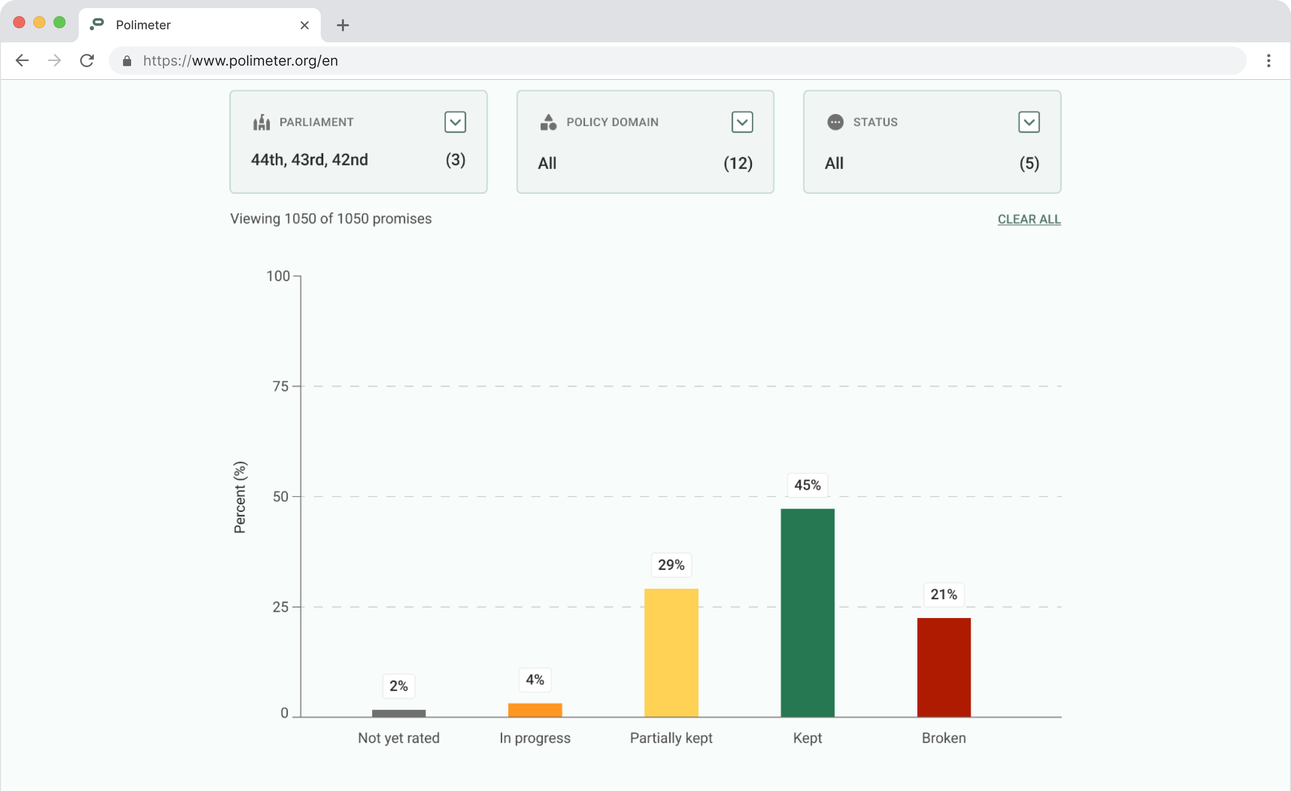
Polimeter
Designing for political transparency at scale.
TL;DR
Polimeter is a civic accountability platform that tracks the fulfillment status of governing parties' campaign promises using peer-reviewed methodology.
I led an end-to-end rebuild, translating rigorous political research for a general audience. It shipped with stakeholders confirming the redesign preserved scientific rigor while improving public legibility. See the final product.
Background
A tool that outgrew its interface
Polimeter tracks whether governing parties follow through on their campaign promises, using a methodology developed and maintained by political scientists. The site has been live since 2011 with the mission consistent: making dense political data legible, non-partisan, and trustworthy for a non-expert audience.
By 2024, the interface hadn't kept pace despite its growing audience. The looming 2025 federal election reignited a long-planned rebuild, and the Managing Director brought me in to lead the design.
Problem
Four problems across two audit tracks
I ran a design audit and a methodology consultation with domain experts in parallel. The two tracks both surfaced usability issues that were also misrepresentation problems.


Hover cards to explore
The redesign had one firm constraint: no simplification that distorts the underlying methodology.
User patterns
- Journalists Deep engagement
Researching specific promises, policy areas, or governments. Need access to evidence and full update histories. - Citizens Surface engagement
Checking high-level political performance at a glance, often without prior context.
Process
From audit to validation
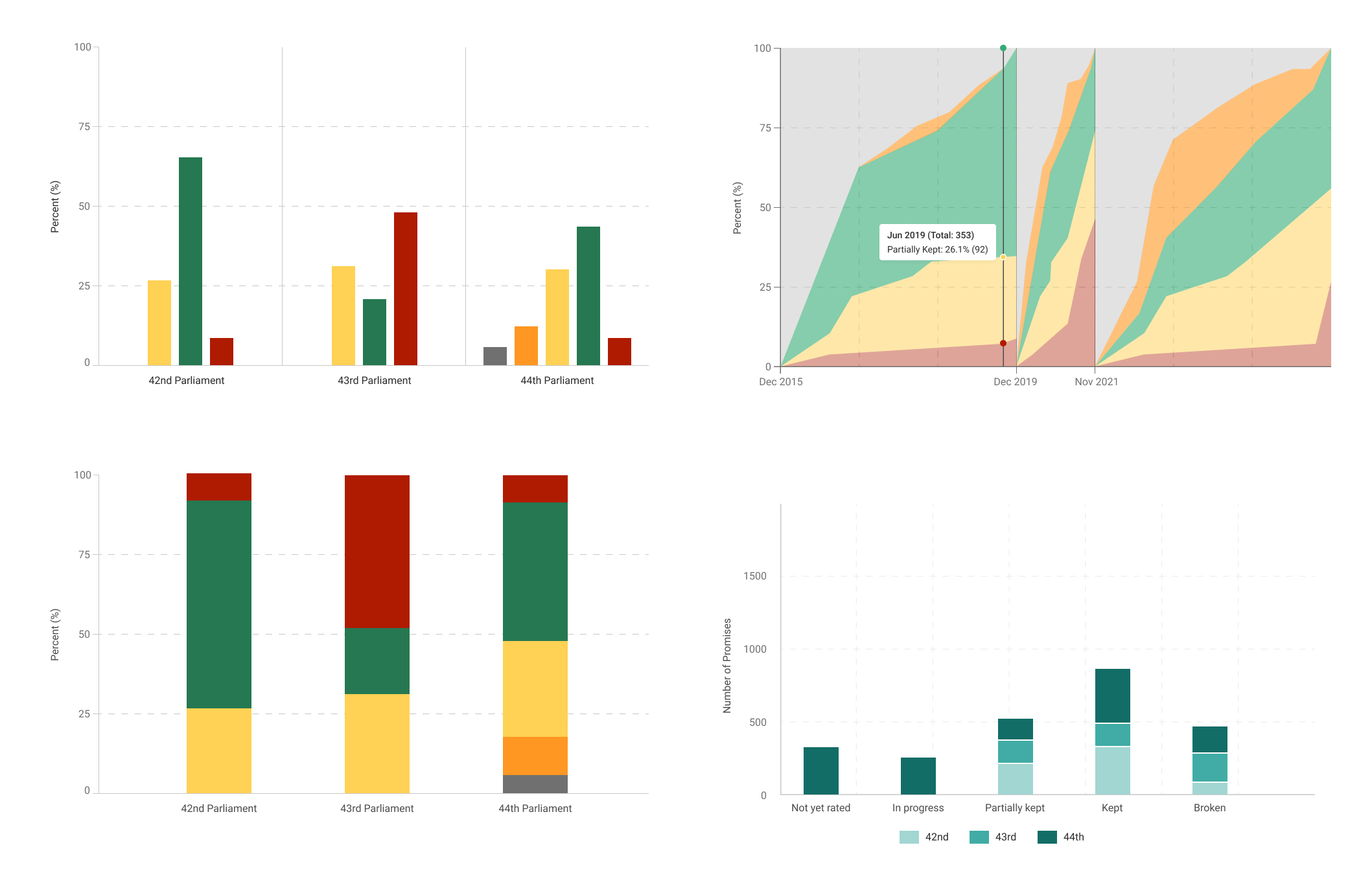
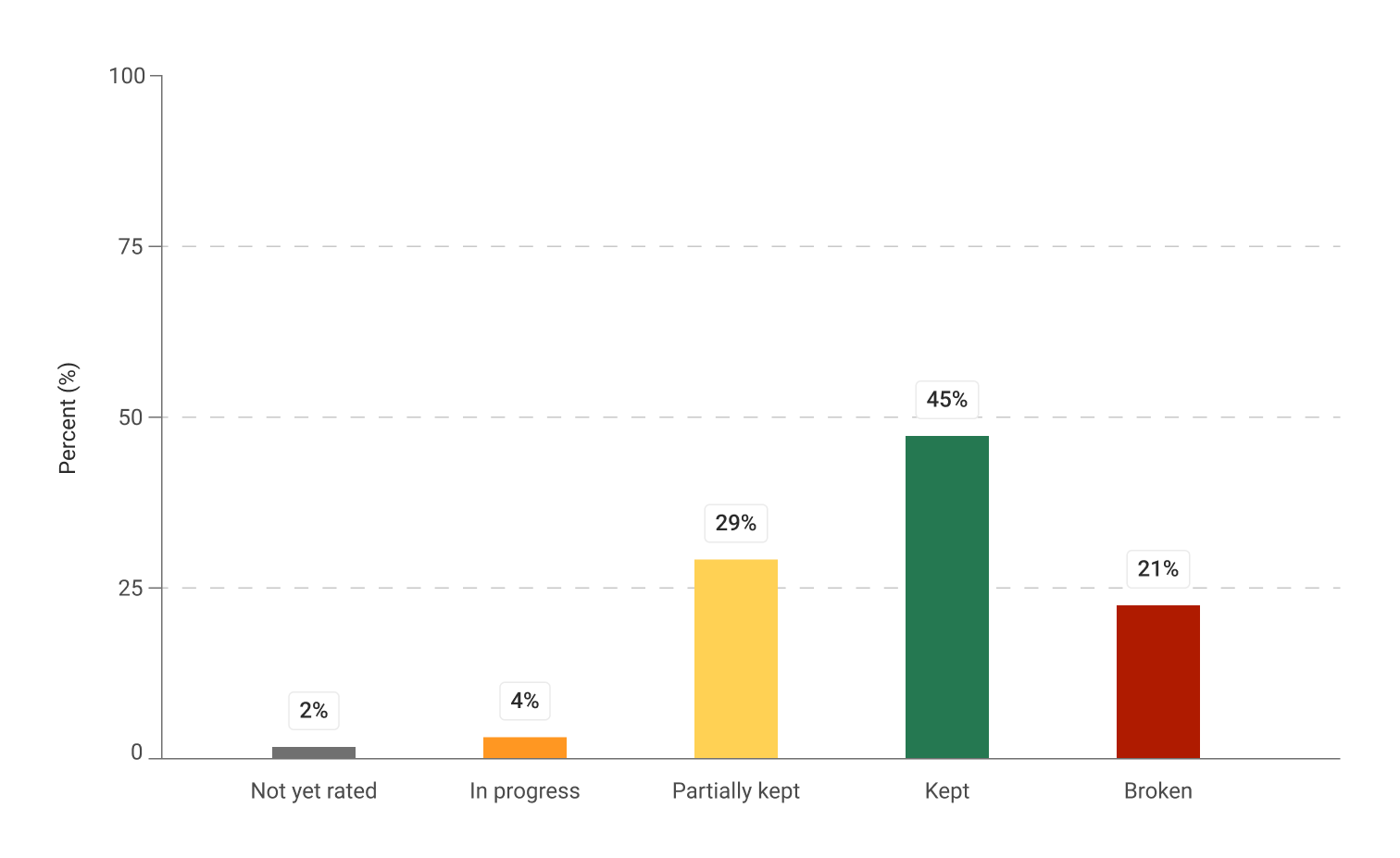
Restructuring the chart for accuracy
The original chart conflated separate mandates into one record. A strong previous term inflated current performance, and a new term inherited promises that didn't belong to it.
I explored three directions: segmented area charts, grouped bars, and stacked bars.
Early explorations
The breakthrough was reframing the axis. Instead of organizing around time, I used the five status categories, with parliament term as a filter. The chart had to show how a government is doing on its promises at a glance. The methodology team confirmed it matched how they wanted the data communicated.
Final design
Designing the promise history page
Journalists needed to drill into individual promises for the full evidentiary trail, but the original page surfaced everything at once with no hierarchy.
Click to expand / collapse

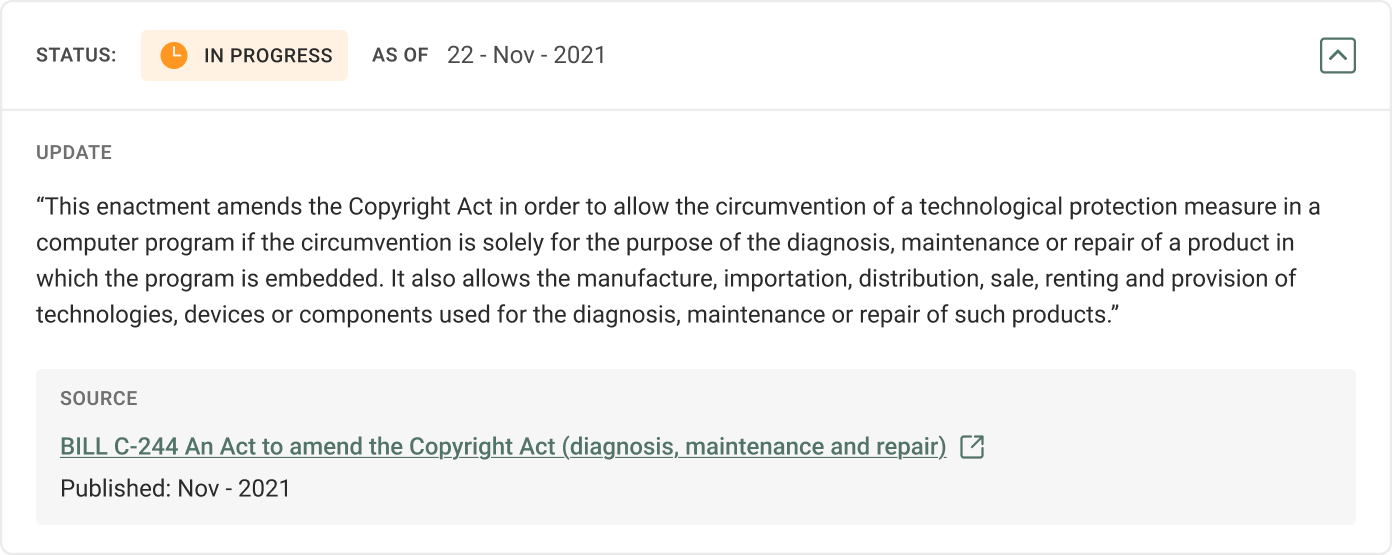
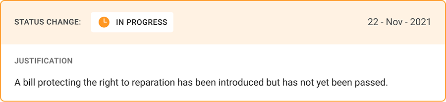
The updated design keeps the vertical timeline (recent to oldest), but now has clear event markers and labeled blocks. Update cards are collapsed by default but expandable, supporting both quick scans and deep inspection.
Streamlining the layout
The original tri-column layout crowded desktop and broke on mobile. I moved to a single-column structure where content hierarchy did the work columns previously did, scaling naturally to mobile.
This forced decisions about what metadata earns top placement, how filters work without a sidebar, and how to keep cards scannable as density increased.
Internal testing for validation
I ran usability sessions with 4 lab members, both with and without domain expertise. The expert sessions were most valuable, surfacing IA issues on the promise history page I hadn't caught, particularly around timeline navigation.
"I'm confused on which one is the most recent status update because they look very similar."
— Political Scientist, on the Promise History pageFinal Product
The structural shift, before and after
Homepage
Jurisdictions became the primary content, lightening the page. Each card shows the essential overview data. The rebuild also unifies the homepage with the rest of the site's design system.
Toggle to compare

Promise Tracker
The page is now single-column. Filters were redesigned into two groups: three promise filter categories and sort/group controls.
Toggle to compare
Promise History
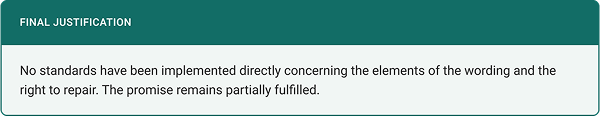
The promise sits in a distinct card at the top, with a labeled timeline of updates below. Each event is labeled by type, and updates are collapsed by default but expandable for the full evidentiary trail.
Toggle to compare

Design system
Built for consistency across pages, clean handoff, and future iteration.
Typefaces
Status Badges


Colors
Impact
Rebuild is live
The rebuild shipped at polimeter.org. Stakeholders and the methodology team confirmed it preserved scientific rigor while significantly improving public legibility.
I designed and documented the rebuild end-to-end, and supported the development team through the early build before transitioning out to pursue graduate studies.
0
Promises tracked
0
Monthly users
Reflections
Domain knowledge as design material
Designing in this specialized environment meant learning the data, the methodology, and how to translate intent visually. This kind of understanding came through working closely with the political scientists, in a way no design framework could replicate.
Open questions on external validation
Internal testing conveniently covered expert and non-expert perspectives, but has its limits. Testing with actual citizens and journalists would reveal whether the conceptual reframes (especially the new chart and promise history flow) land as intended, or still needs refinement.
thanks for reading (✿・‿・)ノ゛
Up next